Earlier this month, our Energy and Climate Hackday brought together about 50 people in London and online, joining from Berlin, Washington D.C., Amsterdam, Graz and Bogota.
With participants working in the private sector, for NGOs, universities and the public sector, we had a good mix of people with different expertise and skills. Some people had some idea on how to communicate some resource scarcity, the threat of climate change or the need to transform the existing energy structure. The challenge for developers was to visualise and present the openly available data – such as the dataset with environmental indicators from the World Bank. It was a great chance to meet and work with people that you don’t meet on a day-to-day basis, and get new ideas and inspiration. The event was sponsored by AMEE, which provides aggregated and automated access to the world’s environmental and energy information, and was hosted at the offices of ThoughtWorks.
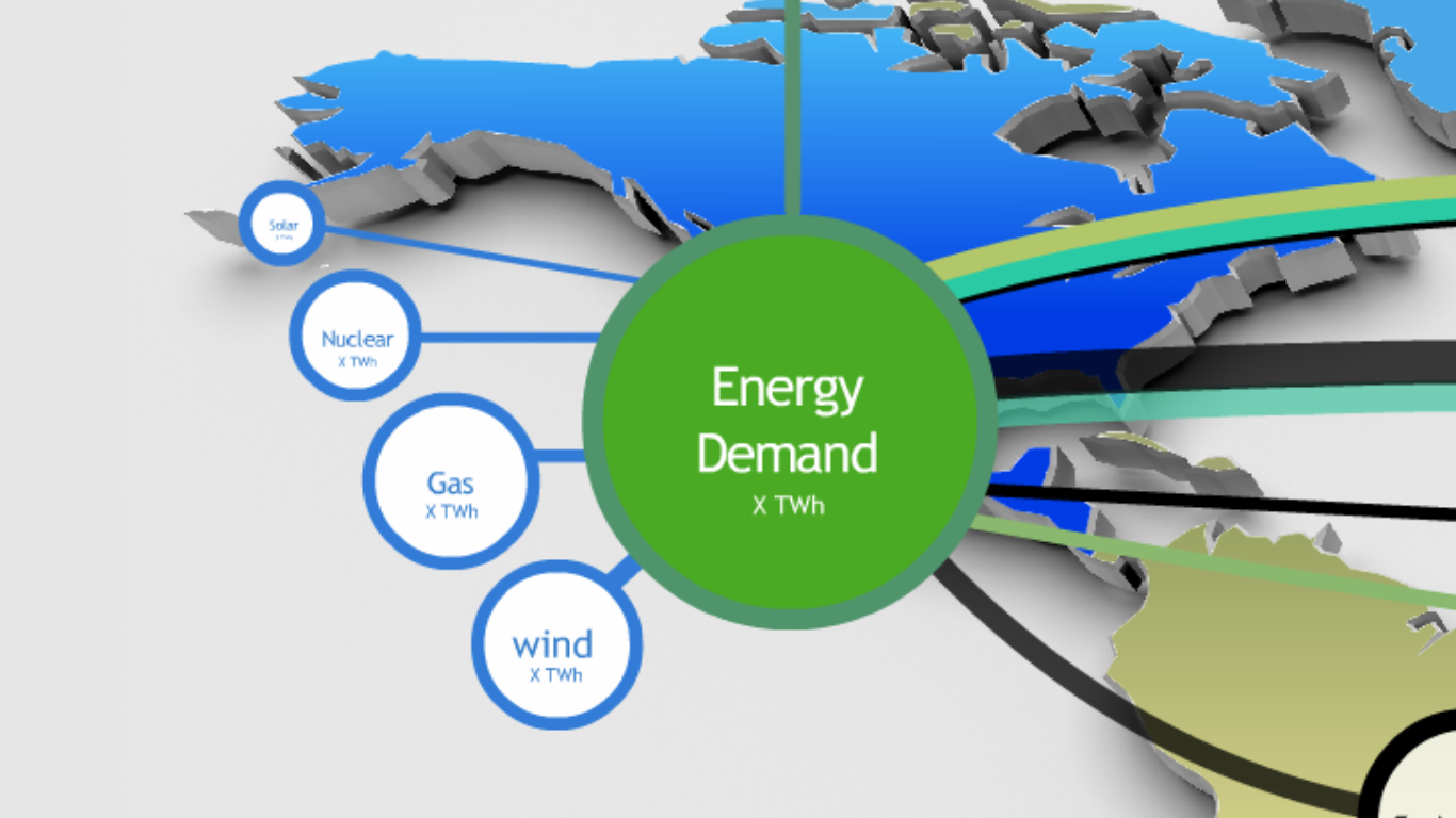 Ed Hogg from the Department of Energy and Climate Change presented the Global 2050 Pathways Calculator Challenge . The Global Calculator would show how different technology choices impact energy security and reflect the geographical opportunities and limitations of energy technologies. It could focus on sectors of the economy, on countries and regions, or combine visualisations on both, showing implications for emissions and temperatures.
The Carbon Budget Challenge: Because of the controversy around how much each country “should” be emitting into the atmosphere, there are different criteria for determining each country’s share. According to the principle of common but differentiated responsibility in international environmental law: “parties should protect the climate system for the benefit of future and present generations of human kind on the basis of equity and in accordance with their common but differentiated responsibility and respective capabilities.” (Art. 3 of UNFCCC) So richer countries should bear a higher responsibility in order to ensure equitable access to sustainable development.
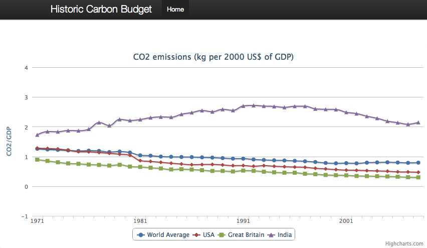
But it is not just the current rate of CO2 emissions that is important. Since carbon dioxide hangs around in the atmosphere for 50 to 100 years, the cumulative total emissions from historical data also need to be accounted for. According to the “polluter pays” principle, calculating the historical footprint of each country is an important way of determining each country’s responsibility. The way emissions are calculated also leaves room for scrutiny (and creative data visualisation). According to empirical evidence, the net emission transfers via international trade from developing to developed countries has increased, which poses the challenge of visualising “imported emissions”. The Historic Carbon Budget group worked on visualising historical time series of carbon dioxide emissions and comparing countries relative to the world mean.
Meanwhile, the Future Carbon Budget group worked on visualising how the world would look under different algorithms for “allocating” emissions to countries, where the weightings of each country would vary based on:
- historical emissions or the extent to which past high-emitting countries have “used up” their rights to emit in the future.
- population change and expected population growth and the rights of future generations to development
- capacity of emission abatement based on GDP and resources to invest in research and development of green technologies.
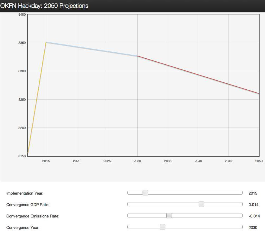
A Contraction and Convergence model, which reduces overall emissions and brings them to an equal level per capita, was put together during the afternoon. Building upon this model, developers designed a visualisation tool where one could input different implementation years, GDP and population growth rates in order to estimate the contraction and convergence path.
The Phone App to Communicate Climate Change Challenge inspired one group to show climate data and visualisations on a phone based on where the person is located. It would be either directed at the members of international organisations missions or the general public. A phone app could be useful to communicate the basic climate change facts about particular regions to the staff of international organisations like the World Bank and the IMF, saving them from wading through long and complex reports. For the general public, “global climate change” often seems too complex and distant: a phone app that communicates climate facts based on location, which can be read wherever and whenever you have time, might reach those who would not otherwise connect with these issues.
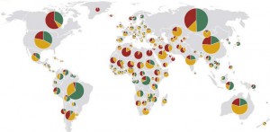
Deforestation and Land Use Challenge gathered Berlin developers to create a visualisation of land use and forest area in the world. The Forestogram shows a world map with pie charts of land use (forest, agricultural land and other areas), based on the 5-year FAO data reports since 1990. When selecting “Usage by Kind” the user sees a beautiful peace sign made of the pies of all countries in the world.
Other ideas which we worked on included a “Comparothon” or a web-based application which allows the visualisation of data based on the relative size of bubbles. Data could be compared either for a single indicator across time, or for a single cross-section in one period.
We would like to thank Ilias Bartolini, who was an amazing host at the offices of ThoughtWorks, our sponsors AMEE and all participants who shared their knowledge and skills for a Saturday. Some notes from the Hackday can be found on the Etherpad. Some prototypes are still being developed, so if you have a similar idea and would like to join in, please let us know!
For contact and feedback: velichka.dimitrova [at] okfn.org
Velichka is Project Coordinator of Open Economics at the Open Knowledge Foundation. She is based in London, a graduate of economics (Humboldt Universität zu Berlin) and environmental policy (University of Cambridge) and a fellow of the Heinrich Böll Foundation @vndimitrova