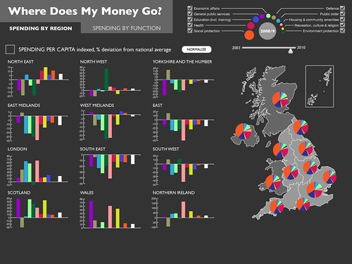
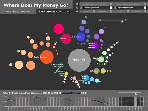
We recently blogged about some mockups for our Where Does My Money Go? project. We’ve now got some new mockups for the project which are show below (click through for full size).
Again, we’d love to hear what you think of the designs! You can either leave a comment below, or pop a note to our discussion list.
One thing to note is that these are only static mockups of what will be interactive visualizations. Animation will primarily be along time axis in the region view, and diving down into spending functions in the function view. A dynamic prototype is on its way soon!
All the data we’re using is available from:
By Region
By Function
Dr. Jonathan Gray is Lecturer in Critical Infrastructure Studies at the Department of Digital Humanities, King’s College London, where he is currently writing a book on data worlds. He is also Cofounder of the Public Data Lab; and Research Associate at the Digital Methods Initiative (University of Amsterdam) and the médialab (Sciences Po, Paris). More about his work can be found at jonathangray.org and he tweets at @jwyg.


nice! but can you include links to the new images on flickr, so we can see them in large format?
Thanks Yishay! Full sized versions are already linked to above on the OKF Wiki.
@Yishay: we’ve reworked the post so that the images here in the post click through to the full size versions.