The following guest post is by Arlen Parsa, who works for Groundswell Educational Films, an American non-profit. In collaboration with the Northwestern University chemistry department, they’ve produced a brilliant example of how opening up data can have a real impact on people’s lives.
##The problem
Many parts of the Navajo Indian reservation in the south-western U.S. are contaminated with radioactive debris leftover from Cold War uranium mining. There are over one thousand abandoned uranium mines in the reservation. Often water sources like wells and springs are contaminated as a result of this.
The US Environmental Protection Agency (EPA) did extensive water sampling back in the late 1990s and early 2000s to find out which water sources were contaminated and which were safer to drink from. They published it, but they never made the data truly available to the public. Especially not the populations that could use it the most – the Navajo people who live there. Basically the only way you could get the data was if you knew who to send a FOIA request to. They’d send you a DVD with scientifically-formatted PDF documents in it. It’s tremendously valuable data (life-or-death data so to speak, especially with the prevalence of contamination-related illnesses on the reservation), but it just wasn’t accessible and wasn’t presented in an understandable format.
##Our solution
Groundswell is a documentary filmmaking organization. In 2000, we brought out a documentary called “The Return of Navajo Boy” which exposed some of the contamination issues on the reservation, and our interest in the subject has continued to grow. We teamed up with the Northwestern University Chemistry Department to make the data more accessible online.
##The result
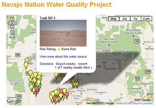
We’ve built a website, navajowater.org with thousands of data points typed up and triple-checked by Northwestern interns. Residents can look up their water sources in a number of different ways, and find out what the risks might be in drinking the water there. We created a map with pins colour-coded according to the safety levels at each site, which you can click-through to find out more details:
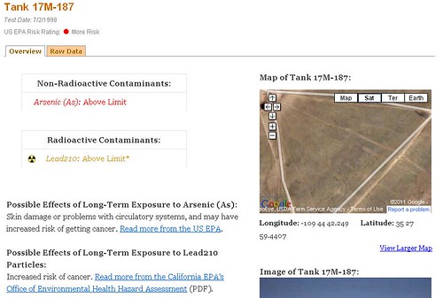
We’ve matched up the public domain datasets on the contamination levels of each well with the EPA’s guidelines on safe limits. Then we’ve added info collected from government websites about the potential health risks associated with exposure above these levels.
Here’s a brief video showing how the website was created:
As Franz Geiger, the Northwestern chemistry prof we teamed up with says in the video, data doesn’t become truly powerful until it’s made available to the public.
So we built tools on there for chemistry students to analyze the data, raw data available for export in spreadsheet formats, and we’ve even matched up maps and photos of most wells so people can verify that they’re really looking at the right information for their well – something the EPA had never thought to do.
If you’d like to know more about the campaign to clean up the Navajo reservation, get in touch.
This post is by a guest poster. If you would like to write something for the Open Knowledge Foundation blog, please see the submissions page.


