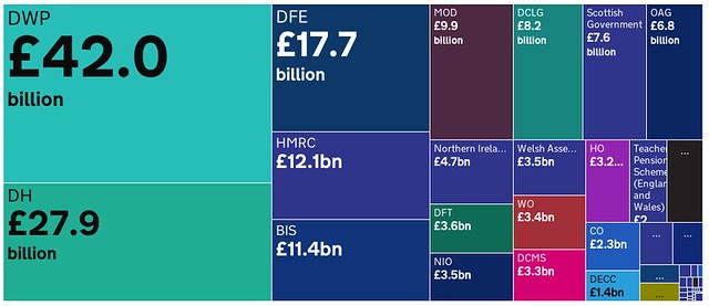
We were pleasantly surprised to learn that this morning the UK government launched a new tool to explore UK public spending.
The ‘Government Interrogating Spending Tool’ (fear not – you the user are supposed to be the giver, not the receiver, of interrogation) or ‘GIST’ is, according to the Cabinet Office, “one of the first of its kind in the world”, giving an “unprecedented view” of public spending, which was previously “only published in clunky spreadsheet form”.
The site gives you a high level overview of quarterly departmental spending, as well as enabling you to see how the big numbers break down.

A little bit of history repeating?
“But wait!”, you might say. Doesn’t this all sound a bit familiar? Haven’t the Cabinet Office and others already released things like this in the past?
Is it really true that before today’s release citizens could only explore UK government spending in “clunky spreadsheet form”?
Around five years ago I wrote a concept note for a project called Where Does My Money Go?, which would enable citizens to explore public spending through interactive visualisations. The idea was a winner of the Cabinet Office’s 2008 Show Us A Better Way competition, and an early prototype of the project was picked up by the BBC. The Open Knowledge Foundation worked with the information designer David McCandless to create new visualisations that let citizens explore how much tax they pay towards different things every day, as well as giving an overview of regional and departmental spending.
Building on this work, our OpenSpending project now has over 14 million spending transactions from over 70 countries, 130 cities – including some of the most detailed data available on UK government spending ever published, such as COINS and all departmental spending above £25k. Some of this data is also available through the government’s Data.gov.uk Spend Browser.
Many others have also been working hard to present government spending to citizens through intuitive visualisations – such as the Guardian’s annual spending overview diagram and their budget visualisations with the Miso Project.
What’s new?
Today’s new spending tool includes two kinds of spending information which, as far as we know, have not previously been released: ‘Project Oscar’ and the ‘Quarterly Data Summary’ (which together would make a pretty great band name).
Project Oscar is the much anticipated replacement for the ‘Combined Online Information System’ (or COINS). It took years of campaigning and carefully crafted freedom of information requests before COINS was released in all (or rather most of) its glorious 120 gigabytes in July 2010. However some of the coverage claimed that it was too big and too difficult for most journalists and citizens to download and make sense of.
It seems likely that the focus of today’s release on usability and presentation will have been at least partly inspired by feedback from the 2010 release. And we’re pleased to see that Project Oscar has been able to see the light of day with such greater ease than its predecessor.
What is it good for? Not just hunting for waste
We think that releasing open data about public money is an essential step towards increasing government accountability and democratising our public institutions – and has many different benefits regardless of where you might be on the political spectrum.
However, we are disappointed to see such one-sided framing around the release, which shoehorned the manifold ways that citizens, journalists and civil society organisations might be interested in using data about public spending into a narrative that strongly focuses on efficiency, waste and cost savings.
With the headline that urges taxpayers to “join the hunt for government savings”, and with quotes that focus on “wasteful spending” and “saving money for taxpayers” the press release leaves little room for the positive characterisation of public spending, the tax system and all of the essential public services (roads, schools, hospitals), that taxpayers contribute to, and little room for many of the ways that citizens and civil society groups might use and interact with this data – beyond hunting for waste.
This very one-sided characterisation highlights the importance of enabling citizens, the media and civil society organisations to be able to use, share, republish, and make sense of spending data for themselves, rather than just taking the way official information is presented at face value. This is why our OpenSpending project strives to enable groups with lots of different views to use spending data in lots of different ways.
In any case, we’re glad to see the UK continuing to lead the world in financial transparency, proactively releasing some of the most detailed information on public money ever seen. We look forward to further developments in this area over the coming months, as the government moves beyond expenditure to focus on things like tax and company registries.
If you’re interested in exploring data on public spending, then you can join our openspending mailing list.
Dr. Jonathan Gray is Lecturer in Critical Infrastructure Studies at the Department of Digital Humanities, King’s College London, where he is currently writing a book on data worlds. He is also Cofounder of the Public Data Lab; and Research Associate at the Digital Methods Initiative (University of Amsterdam) and the médialab (Sciences Po, Paris). More about his work can be found at jonathangray.org and he tweets at @jwyg.


3 thoughts on “What’s the deal with the UK government’s new spending tool?”
Comments are closed.