Contemporary cities seem to be in a race to be increasingly ‘smart’ and data-driven. At smart city Expos around the world, visitors are presented with new visual modes of modes of knowing and governing. Dashboards providing birds-eye views of the real-time movement of objects in the city, are perhaps the most iconic of these visualizations. Often presented in a sort of control room environment, they illustrate the promise of instantaneous overviews things like cars, people and trans bins. These are all relevant objects for organizing dynamic cityscapes and creating an efficient city. In short – they seem like the bureaucratic engineers dream of an ordering tool.
While such visualizations may be good for a form of cybernetic control of the city, it seems that there is a need for different ways of depicting the contemporary city as well. SaveOurAir – a project funded by EU’s Organicities program – was born out of this idea. What if we could activate data about air pollution in other ways that just providing generic overviews of pollution on a map? Would it be possible to tell more ‘local’ data stories about the issue of air pollution? Can the ‘local’ even be operationalized visually in other ways than points of latitude and longitude? If yes, what would the relevant visual metaphors be and which types of data would they draw upon?
From October 2016 to May 2017 we decided to pursue these questions together with a selection of people with a stake in the discussion about air pollution. In this context, the ‘we’ included researchers from The Public Data Lab (see publicdatalab.org) and the ‘people’ included activists, teachers, politicians and public officials from England and Denmark. Through two week-long co-design workshops we co-produced three different functional prototypes that each have its own distinct way of telling a local data-story about air pollution. Full details of all the work can be found on SaveOurAir website, but we will quickly go through each in turn.
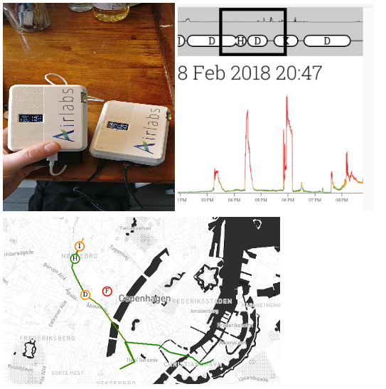
First, in the MyAir project we produced a teaching kit that enables pupils in upper secondary school to explore issues of air pollution with reference to their own daily whereabouts. Armed with a mobile pollution monitor and their mobile phone, pupils in the Danish town of Gentofte constructed personalized and interactive map maps that contained data about the routes they had traveled and the amount of pollution they had been exposed to at various points on these routes. The aim of the teaching kit is to stimulate pupils to do inquiry into the sources of air pollution that influences their personal lives. You can explore the project here.

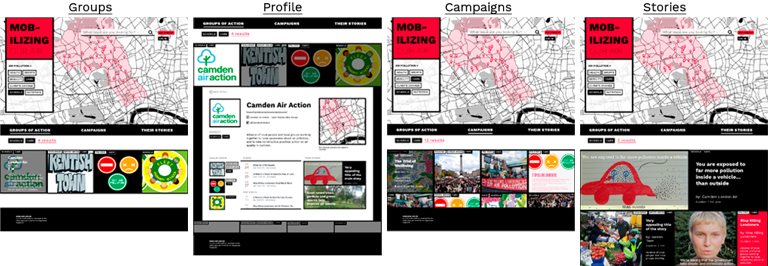
Second, n the Mobilizing Our Air project we produced an online platform which portrays activist groups concerned with air pollution in the Borough of Camden, London. The activist groups’ interests are categorized into interest tags of which the platform’s user can select as many as wished for. Based on the user’s selection the platform shows a geographical map which outlines the location of the activist/activist group. The platform has three main goals: 1. the platform supports local activist groups to connect with each other through visibility on the platform, 2. the platform informs individuals interested in activism about activist groups in their vicinity and invites them to join the movements, 3. the platform brings the topic of air pollution to other activist groups’ attention which already support the cause of better air quality. You can explore the project here.

Third, in the project entitled The Hot Potato Machine we wanted to understand and visually explore different ways of responding to and apportioning responsibility for complex issues such as air pollution. As actors involved in air pollution will often pass the blame, ‘the hot potato’, to someone else we wanted to create a visual interface for exploring what different actors say about each other in relation to how to tackle air pollution. Rather than focusing on measurements of pollutants, we were interested in how digital data might tell us about different ways of seeing air pollution as an issue, different imagined solutions, the fabric of relationships around it, and where there might be tensions, differences, knots and spaces for movement. Our prototype focuses on a specific “issue story” revealing different views on who is responsible for reducing air pollution from diesel taxis. You can explore the project here.

These three projects represent the experimental outcome of the SaveOurAir project and they are good illustrations of the way we approach data in the Public Data Lab. We strive to organize social research as an open process – a process in which the research methods are developed at the same time as their results (the prototypes). But neither the methods nor their results are the specific object of our research. Instead, what we hope to hatch through our interventions are new “data publics”: publics that are not just the passive object of commercial and institutional monitoring, but who produce their own data actively and “by design”.
For more info, contact Anders Koed Madsen.
Anders Koed Madsen is Associate Professor at TANTLab (www.tantlab.aau.dk) at Aalborg University Copenhagen. He works in the area of techno-anthropological studies of digital knowledge organization and has published extensively on digital methods, the re-organization public engagement in a digital era and on shifts in organizational data practices related to big data. Anders is one of the founding co-ordinators of The Public Data Lab (www.publicdatalab.org) and was PI on the Save Our Air Project. For more info: http://aau-cph.academia.edu/AndersMadsen.


