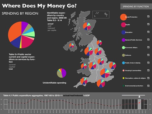
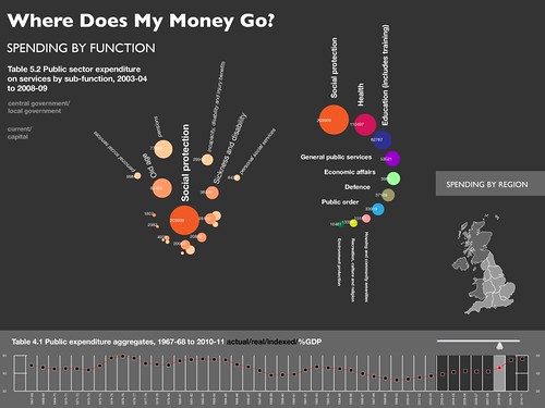
We are currently building a prototype for the Where Does My Money Go? – and we’ve now got the first mockups of what the site will look like…


For full size versions you can see:
We’d love to hear what you think of the designs! You can either leave a comment below, or pop a note to our discussion list.
Dr. Jonathan Gray is Lecturer in Critical Infrastructure Studies at the Department of Digital Humanities, King’s College London, where he is currently writing a book on data worlds. He is also Cofounder of the Public Data Lab; and Research Associate at the Digital Methods Initiative (University of Amsterdam) and the médialab (Sciences Po, Paris). More about his work can be found at jonathangray.org and he tweets at @jwyg.


These look smart, but pie charts have been criticised because of the visual difficulty of comparing areas, rather than lengths (as in a bar chart).
Edward Tufte writes: “A table is nearly always better than a dumb pie chart; the only worse design than a pie chart is several of them, for then the viewer is asked to compare quantities located in spatial disarray both within and between charts (…). Given their low density and failure to order numbers along a visual dimension, pie charts should never be used.”
http://simplecomplexity.net/pie-chart-arguments/
http://charts.jorgecamoes.com/pie-charts-a-neverending-discussion/
http://en.wikipedia.org/wiki/Pie_chart#Criticism
The regional breakdown one is very uninformative. The regional blobs are about the same size and the pies look equally divided.
I suggest reading some of Tufte’s work on the presentation of statistical information. Tufte is very good on why not use a chart when a table will do the job better.
This looks like very top-down data – where I think what people are most interested in is local information – how much grant does my local school get from the Government, and my hospital, how much funding does my GP surgery get per patient, how does that compare to other GP surgeries. Local data is key to making spending data relevant to people, otherwise you’re just applying some snazzy chartjunk to HM Treasury stats.
It looks pretty, but please, please don’t go down then route of maps and charts. it’s too much information to digest, and a really inefficient way of browsing data.
The designers of a site like this need to be asking questions like “how does X person find spending in their local area”, “how does Y person export data”, “How does Z person follow spending on a specific subject”.
This means things like getting search right, email alerts, cross links to parliament rather than charts.
One thing to emphasize right off, which wasn’t said clearly enough in the post, is that the visualizations are to be dynamic while the first-pass mockups above are (necessarily) static.
@Jack: interesting comments on charts versus tables — just the other day someone gave me exactly opposite advice in discussions on this very project :)
As you say this is top-down data. In this prototype phase — we’re aiming to do something in the next month or so! — we are necessarily limited in the data we can gather. I’d be delighted to do something more bottom-up and our long-term aim is to have something at the level of the individual ‘pounds’ — but getting this data (as you know) isn’t easy, even in just one area.
We’ve therefore take the approach of starting at the top and working downwards — something that works both as a way of digging up the data and displaying it (there’s more on this in a previous post).
Any suggestions you (or anyone else) has for particularly fruitful areas to search in would be most really welcome!
@Richard: let me reiterate this is a prototype. For the main effort we plan a clear separation between a “data store” and the frontend so that anyone else can reuse the data just as easily as us (as you no doubt know more than half the effort in these endeavours is getting and cleaning the data).
I think, like Jack, you are advocating more local information. Again I’m in total agreement :) — the limitation here is data, and, again, any suggestions for how to get the relevant local data would be most welcome!
On the UI front I’m intrigued by your suggestions.
What would you think of, say, using the geographical view not just for information display but also as a means of navigating into the data — for example clicking on a region takes you to a region breakdown? (The effectiveness of this depends on how local you want to go I’d guess — if you want really local then you’re going to just type in your postcode or the like …)
Regarding things like search, alerts, parliament links are these things that require lower level data? Or would you say these would still be a good idea even if our breakdown is at a very low level …?
@Francis: would a table instead of a pie work on the first figure as the the table (to fit in) would end up being so small as to be illegible.
Also in this case the pie chart is allowing us to show (and compare) both the amount spent and its breakdown “at one glance” something which would be difficult with a table.
That said your point about the problem of comparing and constrasting a multitude of pie charts is well taken and one obvious possibility would be to provide access info in tabular as well as chart form.
I don’t think the choice is solely between pie charts and tables. Small bar charts, properly arranged, could do the job. Tufte’s ‘Visual Display of Quantitative Information’ really is essential reading here.
On data sources, have you come across government initiative ‘Total Place’? Has a ghastly name but might produce relevant local data. http://www.localleadership.gov.uk/totalplace/
@Francis: you are quite right and I wasn’t intending to offer a simple dichotomy. I suppose my question here could be put more generally: what do you think the best way to display this sort of information here is? (And I will peruse again my Tufte copy).
Re’Total Place’: we hadn’t seen this so thanks for pointing it out. It looks like this could be very interesting, especially the counting theme which proposes:
Couldn’t see any obvious mention of the timeline for this data to become available though.
OK here are my thoughts: people want to compare 1) across indicators (for a region) and 2) across regions (for an indicator). They also want to access both the absolute values for an indicator and the proportional values (for any particular region or indicator).
How about using a clickable heatmap and bar chart?
1) If the user clicks a region in the map then the bar chart shows a breakdown of the indicators in that region. User could switch (in the same bar chart) between absolute values and percentage values.
http://bit.ly/I1EeP
2) If the user clicks a bar in the chart (or a bar chart label/button) then the map becomes a heat map for that indicator, with the colour indicating the value. http://bit.ly/1GlPe2
If people want to get fancy they could select multiple regions (then the bar chart has more than one series of bars) or multiple indicators (then there is more than one heat map).
These are just thoughts – hope they are useful/relevant.
Francis
@Francis: these are really useful ideas and thanks for pointing to some concrete mock-ups — I’ll make sure the others also see them.
If you have any more ideas please do let us know!