The following guest post is by Daniele Galiffa, CEO at Visup.
Some weeks ago we had the opportunity to develop a 24-hour quick prototype
regarding the way the Italian Public Administration spends our money.
Our goal was to highlight the value of using simple and effective information visualization solutions to gain greater insight into data, especially where that data is already publicly available.
We started looking for data and we found 2 good quality sources:
the OKFN Open Spending project and ISTAT, the Italian institution for national statistics.
Before starting, we looked at the OpenSpending interactive visualizations
and we found some issues with them:
- they just focused on one single data-set
- they used a TreeMap to represent non-hierarchical data
- they just provide “static” pictures for a single specific year (or a single specific function)
So…we decided we could do more ;)
We started by combining other data-sets. The first one was the cartography (in order to understand WHERE the money was spent),
and the second-one was a 7 year-series of data about population, helping us understand the amount of money spent for each single citizen during a specific period.
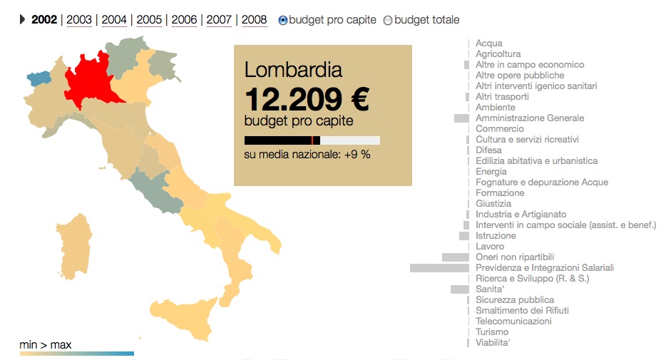
After some discussions we came to the final design of an interactive visualization. Features include:
* a geographic map of Italy,
where each region could be used as a filter to slice data focusing on a single specific region.
* a list of all the functions, ordered alphabetically,
that could be used to filter the data-sets.
* the time-range filter,
listing all the years with available data (2002-2008)
* the calculation-mode filter,
that allows data to be calculated as a total or divided by citizens.
* a detail box,
to get punctual information about the filtered data-sets.
For each function in the list, there is also a bar-chart that makes it easy to find the most “expensive” functions. Each region is also coloured according to a expenses-related gradient,
in order to highlight the amount of money spent in it.
In order to visualize the spending trends during the 2002-2008 period
we calculated maximum and minium values into the whole time-range,
so we could get the maximum and minium peaks among years.
This simple solution highlights yearly variations for a single region and even for each single function.
Variation between years is also visible through a simple play/stop button,
with an animation highlighting data filtered by year.
The web-based application (powered by the growing open-source technology coming out from Stanford)
provides answers to loads of questions, like:
- Which is the region that spent most on R&D during the 2002-2008? And which is the one that spent the most, for each single citizen?
- How much did Regione Puglia spend, for each single citizen, on health services on 2007?
- Where was the most money spent on education during the period 2002-2008? What about the money spent for each single citizen?
- How was money divided among functions during the years?
- How has the military budget, for each single citizen, changed?
- How does spending on transportation in Regione Calabria in 2008 compare with the national average?
We would like to thank the OKFN community for
the chance to share our thoughts with you and
we’d love to hear your feedback and suggestions!
Theodora is press officer at the Open Knowledge Foundation, based in London. Get in touch via press@okfn.org


Hi Daniele,
really a good job!
What’s “the growing open-source technology coming out from Stanford”.
Thank you and congratulation
Ciao Andrea,
thanks for your comment.
The tech from Stanford is D3