


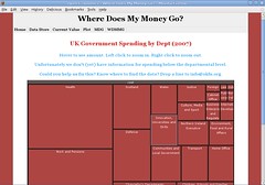
We’ve been doing some more work on Where Does My Money Go?. The project, will provide an interactive represention of UK public finance using maps, timelines, and best of breed visualisation technologies.
We’ve now put together a basic visualisation based on data we’ve cleaned up from the Treasury:
We’ve also had confirmation from the Cabinet Office that there will be some funding available to develop a prototype of the project. We’ve been talking about what to do next on the project on our discussion list. If you have any suggestions or comments – let us know!.


Josh: you’re absolutely right that the next step is to drill down within departments (or functions) — and then to find a nice way to display that information.
As you also correctly surmise the challenge is getting the data. We’re working on locating and cleaning up data using some google docs spreadsheets as detailed here: http://wiki.okfn.org/p/Government_Finances/
Interesting, I think the next stage would be allowing you to drill down when you zoom in on a department, adding new subdivisions, but only showing 3 layers at a time. Presumably you need more government info to get that off the ground.
It also occurs to me that a more advanced way of treating this data would be to show when budgets and departments overlap. Once you had this you could add in a timeline, so that people could see the shift of how people spend money. (Without the overlap map I suspect it could be pretty confusing to move through a timeline, as functions jumping from department to department would make it pretty tricky to read.
More generally, I think there is probably a place for starting with a function and working backwards, which of course you will be able to do if you get more detailed data, so people can see which departments fund certain functions, and in what proportions.