This post is cross-posted from jonathangray.org.

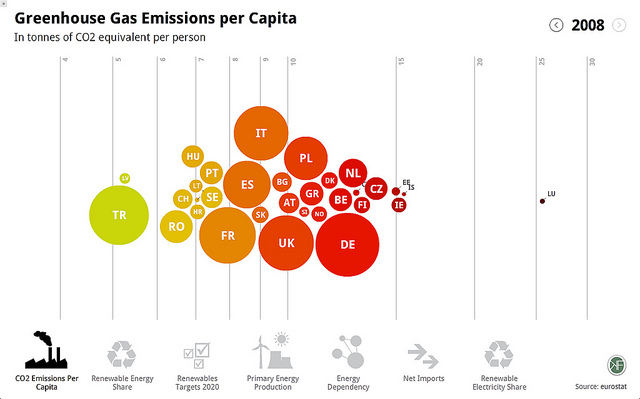
Europe’s Energy, a project I helped to create to put EU energy targets into context, has just won a Silver Award at Malofiej 20. The Malofiej Awards recognise innovative infographics from around the world:
The Malofiej Awards have since 1993 given recognition to the best infographics published in print and on-line across the globe. Every March an international jury meets for nearly four days at the School of Communication at the University of Navarra in Pamplona (Spain). They select those works worthy of gold, silver or bronze medals from among dozens of entries submitted to the competition.
The awards are named after Alexander Malofiej, “an Argentinian cartographer considered to be a pioneer in infographics, and who died in 1987”. This year there were 1,356 entries from 151 media organisations in 29 countries.
The Europe’s Energy project was born out of a series of hackathons I organised in December 2010, which sought to encourage developers, designers and data journalists in several European cities to do useful and interesting things using information from Eurostat. Having a personal interest in climate change, energy and carbon emissions, I was very keen to look into datasets related to these areas. This became the focus of our event in London – and we looked into how energy consumption and production changed in different EU member states over time. The Guardian covered this and I did a writeup with a wishlist of other things we wanted to explore.
In early 2011, I spoke to a press officer at the European Commission who was looking for visual material that would help to put EU energy policies into context for a big meeting at the European Council. I spoke to Friedrich Lindenberg and Gregor Aisch and we decided to try and put something together to enable more people to understand what the EU energy targets meant, how ambitious they were, and how they looked in the context of energy production and consumption in different countries. Soon we were on regular calls with Dirk Heine, Guo Xu, Nathaniel Scheer, and doing late nights to try and get hold of the data we needed, to figure out what it meant, and how best to present it to the public. In just under two weeks the Europe’s Energy was born. In the last 24 hours we crowdsourced translations of the project into 16 languages and I wrote an article for the Guardian Datablog.
The project would not have been possible without the willingness of our team to drop everything and wade knee deep into EU energy policy, data wrangling and data visualisation design. It was supported by the LOD2 project, part of which aims to encourage more people to use open data to provide value to society.
There is a lot more work to be done to continue to gather, combine, interpret and present data related to climate change, energy and carbon emissions. Hopefully Europe’s Energy and projects like it will make some small contribution towards increasing public understanding of complex, but very important, issues. One hopes that Gregor’s beautiful graphics just might help to encourage a few more people to find out more about energy policy, and perhaps even to act to encourage decision makers to increase the share of green energy in the mix.
Dr. Jonathan Gray is Lecturer in Critical Infrastructure Studies at the Department of Digital Humanities, King’s College London, where he is currently writing a book on data worlds. He is also Cofounder of the Public Data Lab; and Research Associate at the Digital Methods Initiative (University of Amsterdam) and the médialab (Sciences Po, Paris). More about his work can be found at jonathangray.org and he tweets at @jwyg.


1 thought on “Europe’s Energy wins a Silver Award at Malofiej 20”
Comments are closed.