Cross-posted on smth.uk
It can be useful to recognise patterns in the challenges we face, and in our responses to those challenges. In doing this, we can build a library of solutions, a useful resource when similar challenges arise in the future. When working on innovative projects, as is often the case at Open Knowledge International, creating brand new challenges is inevitable. With little or no historical reference material on how best to tackle these challenges, paying attention to your own repeatable solutions becomes even more valuable.
From a user interface design point of view, these solutions come in the form of design patterns – reusable solutions to commonly occurring problems. Identifying, and using design patterns can help create familiar processes for users; and by not reinventing the wheel, you can save time in production too.
In our work on Data Packages, we are introducing a new task into the world – creating those data packages. This task can be quite simple, and it will ultimately be time saving for people working with data. That said, there is no escaping the fact that this is a task that has never before been asked of people, one that will need to be done repeatedly, and potentially, from within any number of interfaces.
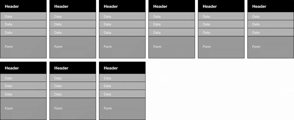
It has been my task of late to design some of these interfaces; I’d like to highlight one pattern that is starting to emerge – the process of describing, or adding metadata to, the columns of a data table. I was first faced with this challenge when working on OS Packager. The objective was to present a recognisable representation of the columns, and facilitate the addition of metadata for each of those columns. The adding of data would be relatively straight forward, a few form fields. The challenge lay in helping the user to recognise those columns from the tables they originated. As anyone who works with spreadsheets on a regular basis will know, they aren’t often predictably or uniformly structured, meaning it is not always obvious what you’re looking at. Take them out of the familiar context of the application they were created in, and this problem could get worse. For this reason, just pulling a table header is probably not sufficient to identify a column. We wanted to provide a preview of the data, to give the best chance of it being recognisable. In addition to this, I felt it important to keep the layout as close as possible to that of say Excel. The simplest solution would be to take the first few rows of the table, and put a form under each column, for the user to add their metadata.
This is a good start, about as recognisable and familiar as you’re going to get. There is one obvious problem though, this could extend well beyond the edge of the users screen, leading to an awkward navigating experience. For an app aimed at desktop users, horizontal scrolling, in any of its forms, would be problematic.
So, in the spirit of the good ol’ webpage, let’s make this thing wrap. That is to say that when an element can not fit on the screen, it moves to a new “line”. When doing this we’ll need some vertical spacing where this new line occurs, to make it clear that one column is separate from the one above it. We then need horizontal spacing to prevent the false impression of grouping created by the rows.
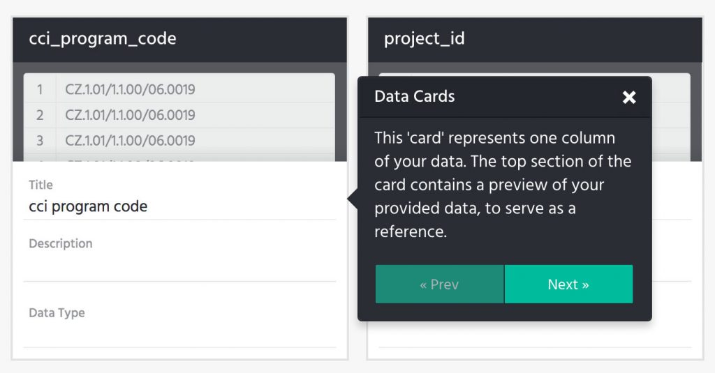
The data-card was born. At the time of writing it is utilised in OS Packager, pretty closely resembling the above sketch.
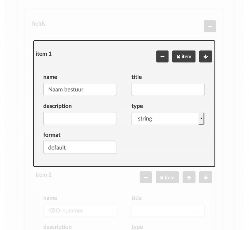
Data Packagist is another application that creates data packages, and it faces the same challenges as described above. When I got involved in this project there was already a working prototype, I saw in this prototype data cards beginning to emerge.
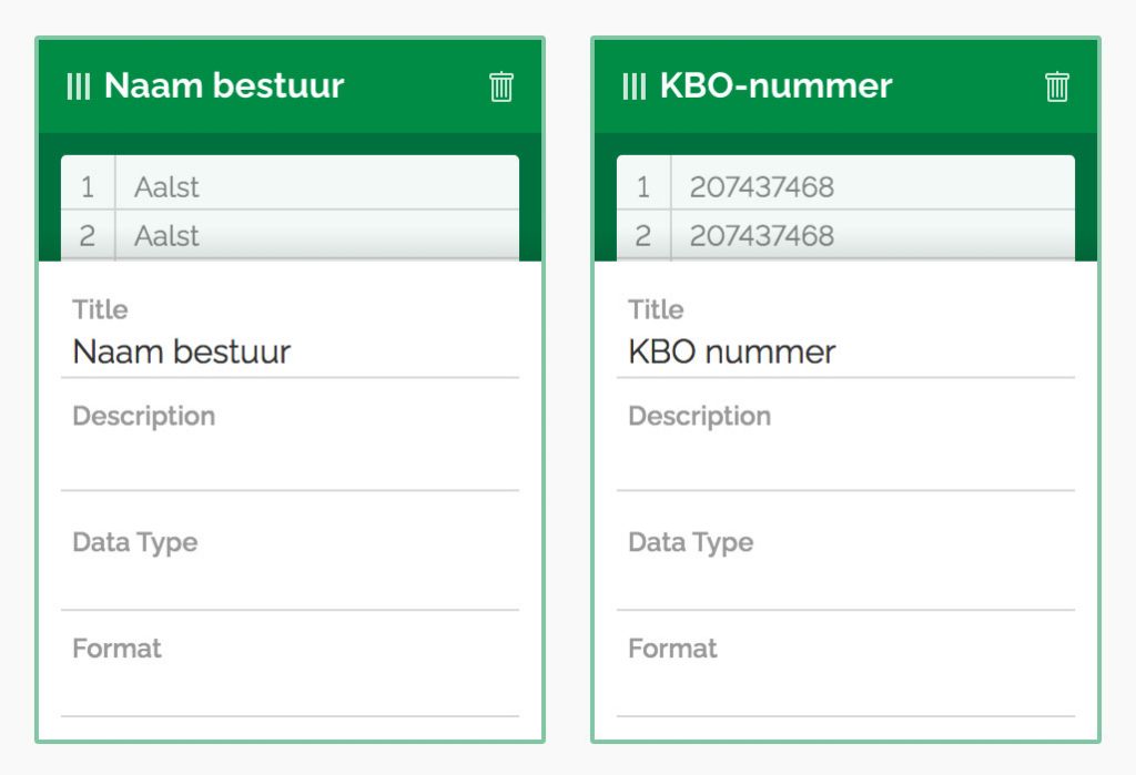
It struck me that if these elements followed the same data card pattern created for OS Packager, they could benefit in two significant ways. The layout and data preview would again allow the user to more easily recognise the columns from their spreadsheet; plus the grid layout would lend itself well to drag and drop, which would mean avoiding multiple clicks (of the arrows in the screenshot above) when reordering. I incorporated this pattern into the design.
Before building this new front-end, I extracted what I believe to be the essence of the data-card from the OS Packager code, to reuse in Data Packagist, and potentially future projects. While doing so I thought about the current and potential future uses, and the other functions useful to perform at the same time as adding metadata. Many of these will be unique to each app, but there are a couple that I believe likely to be recurring:
- Reorder the columns
- Remove / ignore a column
These features combine with those of the previous iteration to create this stand-alone data-card project:
Time will tell how useful this code will be for future work, but as I was able to use it wholesale (changing little more than a colour variable) in the implementation of the Data Packagist front-end, it came at virtually no additional cost. More important than the code however, is having this design pattern as a template, to solve this problem when it arises again in the future.
With a background in design agencies, where he spent the first seven years of his career, Sam is a graphic designer experienced in design for both on and offline media. Sam has good all round design knowledge but specialises in digital design, with a hands on approach to HTML and CSS.
You can see what Sam has been working on recently on his website.


