Over the weekend of 25th and 26th August, the second event in a series of ‘Development Data Challenges’ took place at the Guardian’s offices in London.

What is a ‘Development Data Challenge’?
Development Data Challenges are an interesting concept. They draw together a disparate group of people (we had development experts, coders, designers, data wranglers, journalists and various intrigued individuals), and ask them to use data and technology in order to answer a development-related question.
The last Development Data Challenge took place in Washington DC in June, and the next will take place at OKFest in Helsinki this September. All are welcome!
In London, the day began with an entire wall covered in questions. All were interesting, but it soon became apparent that some were more feasible than others. Even after careful selection, several teams struggled to find the necessary data.
As Julia observed in her blog, ‘the leitmotiv continues to be data availability and data quality’ – ‘if the model was only to continue to deliver those datasets already identified… that would not be good enough’.
The Chosen Projects
Over the course of the weekend, a host of teams worked on a variety of questions.
1. Mapping access to water in South Sudan
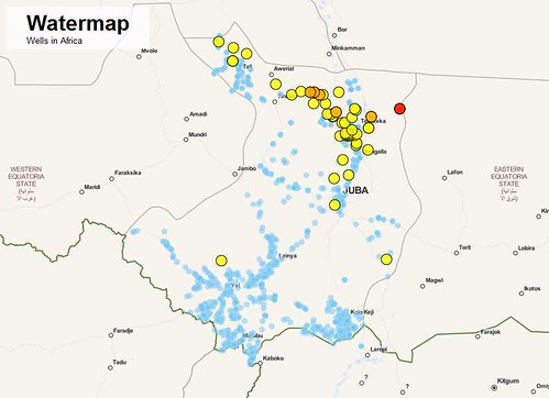
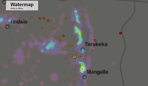
One of the most inspiring projects for me was ‘Watermap’. The team mapped wells and settlements in South Sudan, ultimately allowing you to identify the settlements that are furthest from their nearest water source.
By the end of day one, the team had already produced this visualisation – or at least an alpha version of it. By selecting various filters, you can pinpoint all wells across the country, explore a heatmap of settlements, and even see where all the natural waterways in the country flow. Take a look!


NEWSFLASH: Dominik Moritz has walked us through the process of the tools he used and what he did in order to create this visualisation on the School of Data blog. To get inspired by his Data Wrangling project, head over there and check it out!
2. Media and aid

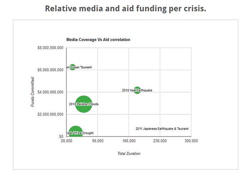
Another team attempted to analyse how media coverage affects aid donations. Sounds simple? Far from it. As Katherine Purvis explains in her blog, ‘media coverage’ had to be reduced to the official YouTube channels of 31 reputable news organisations, ‘donations’ were those recorded by the Financial Tracking Service and ‘natural disasters’ had to be carefully selected (interestingly, no data could be found on donations after Hurricane Katrina). Even then, the data was difficult to wrestle with. But the team managed to come up with this visualisation. The x-axis is TV coverage per minute, the y axis is donations, and the size of the bubble represents the number of people affected. Interesting stuff.
3. Geo-locating Schools and Health Clinics in India
Given the time I have recently spent in India, I was particularly interested to watch this project progress.
The purpose of this project is to use geo-located data to map community services in India. The ultimate aim is to create simple mobile applications which would allow users to search for the nearest services. Primary user stories include: ‘Where is the nearest clinic?’ ‘When is the next vaccination day?’
The project has received data from the Karnataka Learning Partnership.
You can see the work in progress on the Konekta website, view the code on Github and see the data on the Datahub.
4. Aid projects in Malawi

Another team created an interactive visualisation, which geo-locates aid projects in Malawi by sector.
It’s worth having a play with their map. They managed to include a serious amount of information (amount of funding, status of project, donor agency) onto a visualisation that still looks friendly.
The data came from the Government of Malawi’s Aid Management Platform, and the relevant datasets can be found stored on the Datahub.
5. Tracing aid – from tax revenues to the ground
Another group attempted to trace the flow of aid money right from the point of collection to its actual expenditure. This was fraught with difficulty. Often, there are multiple links in the chain: e.g. DfID grant money to the World Bank, who sub-grant to local partners, who may even sub-grant again. How much gets where it is meant to go to? What percentage is lost along the way?
At present IATI data isn’t complete enough to really drill into these questions. The team was often stumped after a long chase by finding the dreaded words ‘Implementing Organisation: Other’. Before the task began, there had been all sorts of interesting discussion about if and how final impact could be measured – but there were many barriers to address before that stage could be reached. Nonetheless, some useful information was collected about aid flows. Perhaps there will be a future opportunity to take this further.
6. How good is IATI data?
The final group worked on a set of tools to examine the quality of data published by aid donors. The Guardian Development blog reported some of their early findings:
- “Only 20% of IATI data files include information on what results – if any – have been achieved by aid projects.
- Less than 0.002% include details on any conditions attached to donor funding.
Next steps include developing tests to examine what data has been published, and how useful it is, and to see how to weight different tests to get an overall data quality “score”.”
Find out more
-
By contributing offline, Rufus Pollock pulled together a neat list of the various tools that people were using during the day. If you used something else, you can add it via this spreadsheet
-
The Guardian Development blog have produced an excellent summary of the day, with links to much of the raw data and output code.
-
Come along for the next event in Helsinki!
-
… And don’t forget to check out Dominik’s post about Watermap on the School of Data blog.


